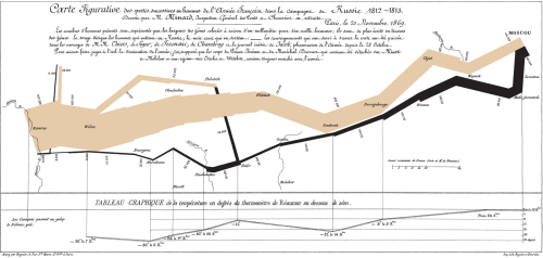
From an article in Cartographia. One of the better of examples of a graphic, which while being simple still conveys a wealth of information both visual and quantitative.
I actually have this around somewhere and should dig it up, dust it off and hang it.
Napoleon Bonaparte began his ill-fated 1812 invasion of the Russian Empire with 422,000 men. With each step further into Russian territory, more and more soldiers died or deserted. By the time it reached Moscow, Napoleon’s army had dwindled to 100,000 men–already less than a quarter the size it had been at the start. During their disastrous retreat out of Russia, temperatures plunged to −37.5 °C. Nearly half the remaining survivors of the invasion were killed during the botched crossing of the Berezina River. Of the 422,000 men who set out on the invasion, barely 10,000 of them returned alive.Napoleon’s Invasion of Russia
Published April 30, 2008 Charles Joseph Minard , History , War & Security 50 Comments
All this information is readily visible in the chart above, created by the French civil engineer Charles Joseph Minard, which ingeniously combined both a map of the campaign and a visual representation of the number of men remaining in Napoleon’s doomed army. The thickness of the line is proportional to the number of men in the army (one millimeter equalling 10,000 men), with the beige section representing the offensive toward Moscow, and the black line the retreat. Below, Minard also included a second chart showing the temperature on various days during the retreat (Minard used the Réaumur scale for his temperatures, as was commonplace at the time. Converted to Celsius, this makes the coldest part of the retreat a whopping −37.5 °C). For a large view of the chart, click on the picture above.
Although Minard includes a description above his chart, it is almost completely unnecessary; all the pertinent information is readily apparent from a close examination of the chart itself. Minard was a master at the production of maps such as these that combined tremendous amounts of data with geographic representations. Edward Tufte, an expert in the visual display of quantitative information, has called this chart “probably the best statistical graphic ever drawn.” More of Minard’s works will undoubtedly be featured here in time.
It’s also important to note why, on a blog about maps, the first post is in actuality more of a chart. Although the most striking feature of the chart is the thinning line of soldiers, the map in the background plays an important role, showing the cities and rivers the army traversed on its way into and out of Russia. This chart demonstrates how, with good planning a design, maps can operate in concert with many other types of information to create stunning displays of information.


No comments:
Post a Comment